In today’s fast-paced world, our bedrooms have become more than just places to sleep—they’re sanctuaries. A well-designed bedroom can offer emotional comfort, support deeper rest, and gently prepare the mind for sleep. And when it comes to creating a peaceful space, colour plays a starring role.
In this article, we explore the most calming bedroom colour palettes for 2025, all designed to help promote relaxation, balance, and better sleep. Whether you’re planning a full revamp or a simple refresh, these serene shades will turn your bedroom into a true retreat.
The Psychology of Calm Colours
Colour psychology tells us that certain shades naturally soothe the nervous system, reduce mental clutter, and promote a sense of safety. Muted tones, cool undertones, and nature-inspired hues tend to evoke peace and quiet—two essentials for a good night’s rest.
In 2025, serenity in design is all about softness, subtlety, and connection with nature. The latest bedroom palettes are less trend-driven and more wellness-focused: colours that feel timeless, tactile, and emotionally supportive.
Top Calming Colour Palettes for Serene Bedrooms
1. Misty Blue and Soft Grey
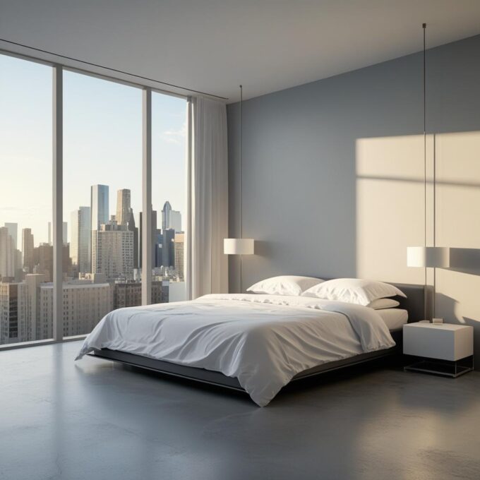
Cool and airy, this classic pairing instantly calms the mind. Misty blues (think soft sky or sea foam) paired with pale greys evoke early morning light, gentle clouds, and open skies.
Best for: Coastal, minimal or Scandinavian-inspired interiors.
Pair with: Crisp white bedding, silver accents, natural wood, and linen textures.
Why it works: Blue lowers heart rate and blood pressure, making it one of the most restful colours for bedrooms.
2. Sage Green and Stone
Grounding yet gentle, sage green brings nature indoors without being overpowering. When combined with soft stone or mushroom neutrals, it creates a balanced palette ideal for winding down.
Best for: Earthy, modern rustic, or biophilic spaces.
Pair with: Rattan light fittings, clay-toned pottery, and organic cotton bedding.
Why it works: Green is linked to balance and calm, while muted neutrals add softness without starkness.
3. Warm Sand and Cream
For those who prefer warmer tones, sandy beiges and creamy whites create a cocooning effect. These shades feel sun-kissed and soothing, ideal for bedrooms with natural light.
Best for: Mediterranean-inspired or Japandi interiors.
Pair with: Bamboo accents, off-white throws, brushed gold fixtures, and textured headboards.
Why it works: Warm neutrals evoke natural elements like beachscapes and desert tones, promoting a sense of warmth and ease.
4. Lavender Grey and Dusty Mauve
These gentle purples are having a quiet moment in 2025. Subtle lavender hues with grey undertones are romantic, dreamy, and softly feminine without being sweet or overpowering.
Best for: Vintage, romantic, or transitional interiors.
Pair with: Antique brass, soft lighting, lace or velvet cushions, and pale wood furniture.
Why it works: Purple is traditionally associated with calm and spirituality, and when softened, it feels luxurious and restful.
5. Pale Peach and Muted Coral
Warm, nurturing, and surprisingly versatile, these peachy tones are soft enough to relax in yet warm enough to bring personality. Think barely-there blush with hints of terracotta or coral.
Best for: Soft boho or mid-century inspired rooms.
Pair with: White bedding, woven rugs, wooden bedframes, and dried florals.
Why it works: Peach tones can promote emotional warmth and a feeling of comfort, perfect for reducing evening stress.
6. Cloud White and Taupe
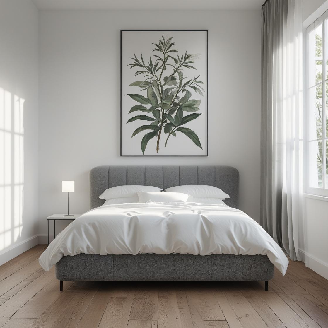
This minimalist palette leans into simplicity. A creamy, slightly warm white paired with gentle taupe tones creates an effortless calm that never goes out of style.
Best for: Minimalist, contemporary or Scandi-style bedrooms.
Pair with: Simple lines, tactile bedding, black accent frames, and ambient lighting.
Why it works: Reducing visual stimulation helps the brain to relax and prepare for sleep—this palette creates a peaceful, uncluttered environment.
Tips for Creating a Serene Bedroom
You don’t have to overhaul the whole room to make it feel more peaceful. Subtle changes and thoughtful styling go a long way in supporting restful nights.
1. Choose matte or eggshell finishes – Avoid high-gloss paints which reflect light and create visual stimulation. Soft finishes create a more calming atmosphere.
2. Layer soft lighting – Use warm, dimmable lamps, fairy lights, or sconces instead of harsh overhead bulbs. Lighting can completely change how colour feels at night.
3. Introduce texture – Calming colours come to life when paired with natural fibres like cotton, wool, or linen. Think plush throws, quilted bedding, and soft rugs.
4. Keep patterns subtle – If you love pattern, go for tone-on-tone or very fine prints. This keeps the space visually calm and not too busy for sleep.
5. Minimise visual clutter – Stick to a cohesive colour palette throughout your bedding, walls, and decor. Use storage to keep surfaces clear and distractions minimal.
Final Thoughts
A calm bedroom begins with colour. The right palette can signal to your body and mind that it’s time to slow down, switch off, and restore. In 2025, the most inviting bedroom colours are soft, muted, and inspired by nature—whether it’s a breeze over the sea, a walk through woodland, or the glow of a warm sunset.
Whether you gravitate towards cool tones like misty blue or earthy shades like sage and sand, the key is to choose colours that make you feel calm, safe, and at ease.
Your bedroom should feel like a breath of fresh air at the end of every day. Let colour help you get there.








Leave a comment