Nature’s Role in Defining the Year’s Colour Mood
Every year, new colour trends sweep through our homes, wardrobes and screens — but behind these shifts is often a consistent and calming muse: nature. From the golden hues of an autumn forest to the soft blues of a winter sky, the natural world plays a powerful role in shaping our emotional relationship with colour.
In an era defined by rapid change, digital overwhelm and global uncertainty, it’s no surprise that people are increasingly turning to nature-inspired palettes to bring peace, clarity and connection into their lives. Colour forecasters, interior designers and consumers alike are all drawing from the outdoors to guide how we feel — and how we decorate.
Here’s how nature is helping to define the colour mood of the year — and why its influence continues to grow.
A Growing Desire for Calm and Grounding
In recent years, there’s been a noticeable shift towards softer, more organic tones. Earthy neutrals, mossy greens, sky blues and clay-inspired browns are dominating everything from paint charts to fabric swatches.
This trend is rooted in a deeper emotional need. As the world becomes more complex, people are seeking simplicity and authenticity — and natural colours offer exactly that. They’re familiar, grounding, and deeply human.
Key nature-inspired colours:
- Olive green – calm and grounding, echoing forest leaves and fields
- Warm terracotta – reminiscent of clay, soil and sun-baked landscapes
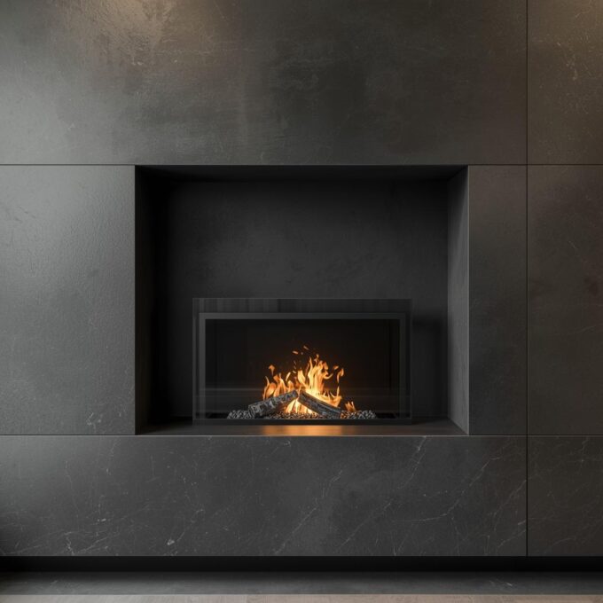
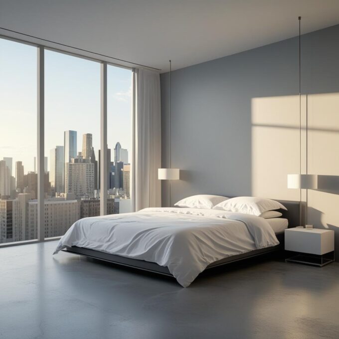
- Stone grey – timeless and neutral, inspired by pebbles and rock formations
- Sky blue – light and fresh, offering clarity and serenity
These shades help bring the outside in, supporting well-being while fostering a gentle, cocooning atmosphere at home.
The Rise of Biophilic Design
Biophilic design — a concept that focuses on connecting interiors with nature — has exploded in popularity over the last decade. It’s not just about adding houseplants (though they certainly help); it’s about creating an environment that mirrors the sensory richness of the outdoors.
One of the most important elements of this approach is colour. Natural light, leaf-green walls, sandy beige textures, and wooden tones all contribute to interiors that feel alive and restorative.
Why it matters:
Research shows that environments inspired by nature can reduce stress, lower blood pressure and improve mental focus. In this context, nature-derived colour palettes aren’t just beautiful — they’re good for us.
Seasonal Shifts and Emotional Influence
Each season offers a unique colour story — and designers often mirror this cycle in their work.
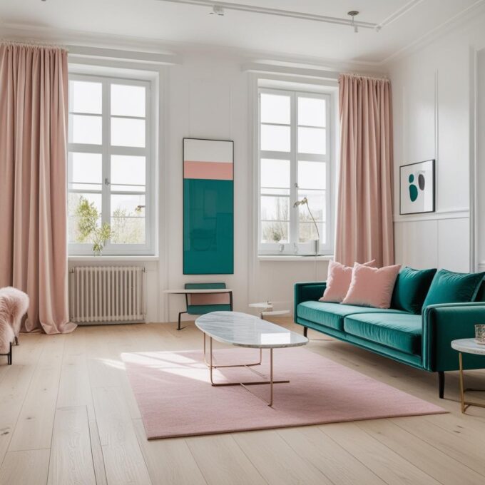
- Spring brings in fresh greens, butter yellows and soft petal pinks — hopeful, light, and full of renewal.
- Summer leans into ocean blues, crisp whites, and coral accents — vibrant, sun-soaked and optimistic.
- Autumn delivers amber, burnt orange, forest green and chestnut — warm, cosy and nostalgic.
- Winter offers deeper tones like pine, plum, slate and frost — introspective, elegant and calming.
These seasonal shifts subtly influence what feels “right” throughout the year. Nature gives us a rhythm to follow — not just in temperature and light, but in colour as well.
Sustainability and Colour Choice
As environmental concerns move to the forefront of public consciousness, there’s a growing desire to live more sustainably — and colour trends are reflecting that too.
Brands and consumers alike are embracing earthy, recycled and “raw” tones that feel authentic and low-impact. Think muddy browns, seaweed greens, ochres and other hues that suggest a connection to the land and a slower pace of life.
Even paint companies are creating palettes inspired by natural pigments and traditional materials, using terms like “moss”, “chalk”, and “flax” to evoke that eco-conscious feel.
Natural Landscapes as Trendsetters
Nature’s influence on colour doesn’t just come from plants and seasons — it also comes from place. Landscapes around the world provide ongoing inspiration for the colours that rise to prominence each year.
Examples include:
- Scandinavian fjords and coastlines inspiring cool greys, soft blues and driftwood tones
- Mediterranean landscapes bringing in terracotta, ochre and olive
- Desert scenes influencing warm sands, sunset pinks and burnt siennas
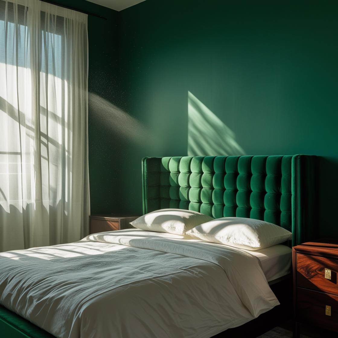
- Tropical rainforests introducing deep emeralds, rich browns and vibrant floral accents
Designers are increasingly looking at travel, geography and the outdoors as colour moodboards — allowing people to bring the beauty of far-off places into their own homes.
Final Thoughts: Why Nature Still Leads the Way
In a world shaped by fast fashion, digital interfaces and artificial intelligence, nature remains one of the few constants we can turn to for peace, perspective and inspiration.
Each year, as new colour trends are announced, they are more often than not grounded in the beauty, balance and emotional richness of the natural world. Whether it’s a deep forest green that evokes a woodland walk or a sandy beige that recalls a quiet beach, these colours help us feel calmer, more connected, and more at home — wherever we are.
So, next time you’re choosing a paint colour, redecorating a room, or selecting a new cushion cover, look to the outdoors. The palette is endless — and it always speaks to something deeper.


Leave a comment