Cultural Movements and Their Impact on Colour Psychology
Colour doesn’t exist in a vacuum. The way we respond to certain hues is shaped not only by science and biology, but also by culture, history, and shared experience. As cultural movements emerge, evolve and ripple through society, they leave behind traces in our visual world — influencing fashion, design, advertising, and most strikingly, the colours we surround ourselves with.
In interior design, colour psychology is a powerful tool. It speaks to emotion, mood and memory. But to truly understand why certain colours resonate at different points in time, we need to consider the broader cultural backdrop. From rebellious countercultures to sustainability-driven lifestyles, here’s how cultural movements have shaped our perception of colour.
1. The 1960s: Counterculture and Psychedelia
The 1960s marked a time of rebellion, free expression and political upheaval. This era’s cultural movements, including the hippie and psychedelic subcultures, rejected conservative norms and embraced bold experimentation.
Impact on colour:
- Electric pinks, vivid oranges, and acid greens dominated interior design and fashion.
- Bright, clashing colours became a form of protest against conformity.
- Psychedelic art and interiors used swirling patterns and saturated tones to challenge perceptions and reflect altered states of consciousness.
These colours were more than just decorative — they became visual signifiers of freedom, non-conformity and countercultural energy.
2. The 1970s: Earthy Realism and Environmentalism
In response to social and environmental concerns, the 1970s ushered in a more grounded, nature-inspired aesthetic. As the environmental movement grew, so did a yearning for simplicity and harmony with the natural world.
Impact on colour:
- Warm browns, mossy greens, burnt oranges and mustard yellows were everywhere.
- Interiors embraced wood panelling, avocado-toned kitchens and rust-coloured accents.
- These earthy palettes symbolised a return to organic living, slower lifestyles, and connection with nature.
The colours of the 70s reflected a cultural desire to re-establish balance — both with the planet and within ourselves.
3. The 1980s: Consumerism and Excess
The 1980s were shaped by economic boom, globalisation and a culture of ‘more is more’. It was a decade of big hair, bold design and unapologetic opulence.
Impact on colour:
- Neon brights, jewel tones and pastel combos made interiors feel futuristic and flashy.
- Teal, magenta, turquoise and gold were used liberally, often side by side.
- Memphis design emerged — playful, geometric, and colour-saturated — a rebellion against the seriousness of modernism.
Colour during this time mirrored a cultural embrace of abundance, youth and consumer confidence.
4. The 1990s: Minimalism and Grunge
With the rise of alternative music, digital technology, and a pushback against 80s glitz, the 1990s took a more subdued approach. Simplicity, understatement and introspection became the mood of the decade.
Impact on colour:
- Neutrals like taupe, grey, beige and black came to the forefront.
- Grunge culture brought in darker, moodier tones like burgundy, olive and charcoal.
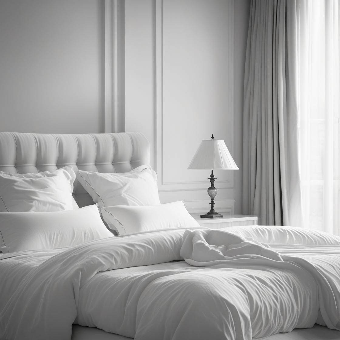
- Scandinavian minimalism popularised whitewashed interiors and cool, desaturated palettes.
The colour trends of the 90s reflected a cultural reset — a desire for authenticity and pared-down aesthetics in an increasingly digital world.
5. The 2000s: Global Influence and Digital Modernism
As the internet opened the world up, global influences began shaping Western design more than ever. Simultaneously, technology advanced rapidly and design began to look toward the future.
Impact on colour:
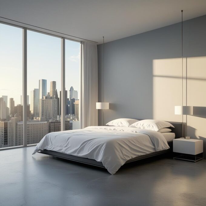
- Sleek monochrome palettes and tech-inspired silvers and greys became the norm.
- Colour accents were used sparingly — lime green, cobalt blue and chrome added punch to minimal designs.
- Global travel and cultural crossover introduced saffron, indigo and turquoise into contemporary interiors.
This era’s colour psychology leaned into innovation and connectivity, with nods to internationalism and digital sophistication.
6. The 2010s: Mindfulness and the Wellness Movement
In response to social media burnout, environmental anxiety, and a collective craving for calm, the 2010s saw a renewed interest in wellness, mindfulness, and minimalism — this time, with a softer edge.
Impact on colour:
- Pastel pinks, sage greens, warm greys and blush tones dominated.
- “Millennial pink” became a cultural phenomenon, symbolising softness, inclusivity and calm.
- Biophilic design brought in soft greens and sandy neutrals, inspired by nature.
This palette represented self-care, serenity and a shift towards sustainable, conscious living.
7. The 2020s: Resilience, Expression and Eco-Consciousness
The global pandemic, political upheavals and climate crises have dramatically reshaped how we live — and how we decorate. In the 2020s, colour is being used both as an emotional balm and a bold statement.
Current colour psychology trends:
- Deep blues and forest greens offer stability and grounding.
- Sun-baked terracottas and ochres evoke warmth and nostalgia.
- Bright accents — coral, cobalt, saffron — represent joy, optimism and resilience.
- Sustainable design movements have reintroduced earth tones, vintage palettes and recycled materials.
There’s a duality in today’s colour choices: soothing shades for mental wellbeing, and expressive colours that embrace individualism and cultural diversity.
Final Thoughts
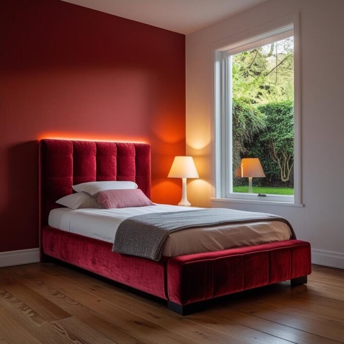
Cultural movements leave more than social or political legacies — they shape our visual preferences and influence the way we respond to colour. From the radical reds of rebellion to the calming greens of eco-conscious design, every hue we choose tells a story about the times we live in and the values we hold.
Understanding this link between culture and colour allows us to make more meaningful, intentional design choices — turning our homes not just into beautiful spaces, but into reflections of who we are and what we believe.







Leave a comment