
Understanding the Difference Between Shades and Colours
Colour is a powerful design tool, capable of transforming the mood and atmosphere of a room. But when it comes to choosing the right colour for your space, it’s essential to understand the difference between colour and shade. These two concepts play a vital role in how a hue can influence the feel of a room, from how light or dark it appears to the emotional impact it delivers. Let’s break down the difference and then look at how the Spring/Summer 2025 colours—Eclipse (19-3810 TCX), Antique White (11-0105 TCX), Rum Raisin (19-1321 TCX), Moonbeam (13-0000 TCX), and Blue Granite (18-3933 TCX) impact the atmosphere of your space.
Colour vs. Shade: What’s the Difference?
- Colour: This refers to the base hue, the name or perception of the colour itself, such as red, blue, yellow, green, or purple. Colours are identified by their wavelength and are fundamental in art, design, and visual psychology.
- Shade: A shade is simply a variation of a colour, created by adding black to the original hue. This results in a darker, deeper version of the base colour. In contrast, a tint is a lighter version of a colour, created by adding white.
Understanding this distinction is important in interior design because while colour choices define the character of a room, shades impact the room’s ambiance and the emotional response it elicits. A deep shade of blue can make a space feel intimate and dramatic, while a lighter tint of blue can evoke a sense of openness and tranquility.
How Pantone Colours Impact the Feel of a Room
Now that we understand the difference between colours and shades, let’s look at how specific Pantone hues can create different emotional atmospheres within a room. Below, we compare each colour’s emotional impact and its best use in interior design:
1. Pantone 19-3810 TCX – “Eclipse”
Colour Analysis:
Eclipse is a deep, muted blue-black that can almost feel like a shade of navy or charcoal, but with a slightly cooler, richer undertone. As a dark, complex colour, it creates a sense of depth and sophistication.
Psychological Impact:
The rich darkness of Eclipse makes it perfect for creating a luxurious, intimate feel in a room. This colour evokes feelings of mystery, power, and introspection. It’s perfect for spaces where you want to feel cocooned and embraced, such as bedrooms or cozy living rooms.
Room Feel:
When used in a room, Eclipse brings a sense of drama and elegance, creating a powerful, calm atmosphere. The deep tone can absorb light, making the space feel more intimate and focused. This colour works well in accent walls or smaller rooms like home offices or libraries, where deep, rich colours can create a sense of calm and concentration. Pair it with soft neutrals, metallic finishes, or deep jewel tones for added sophistication.
2. Pantone 11-0105 TCX – “Antique White”
Colour Analysis:
Antique White is a soft, warm off-white with subtle yellow and beige undertones, making it feel rich and inviting. While it’s a neutral, it carries more warmth than a typical stark white, giving it a sense of comfort and timelessness.
Psychological Impact:
This colour evokes feelings of tranquility, warmth, and familiarity. It has a soothing quality that makes spaces feel light and open, yet cozy and inviting at the same time. Antique White can foster a sense of relaxation and peace, making it ideal for spaces where you want to unwind or entertain in comfort.
Room Feel:
In a room, Antique White makes the space feel airy yet grounded. It can visually expand smaller rooms, making them feel brighter without feeling cold or sterile. Ideal for living rooms, kitchens, or dining areas, this colour creates a welcoming atmosphere. Antique White pairs well with both traditional and modern furnishings, and it can be complemented with soft pastels, light woods, or even darker accents like rich browns and gold.
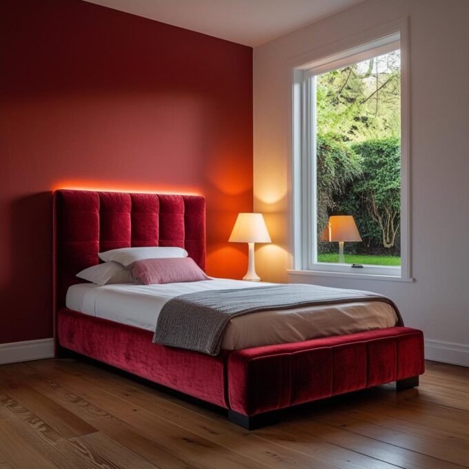
3. Pantone 19-1321 TCX – “Rum Raisin”
Colour Analysis:
Rum Raisin is a dark, warm burgundy with brown undertones. This colour can be considered a shade of wine red or aubergine, with its deeper, earthier qualities. It feels rich and grounded, and its warmth makes it especially inviting.
Psychological Impact:
This colour brings a sense of luxury, comfort, and coziness to any room. Rum Raisin evokes feelings of warmth and sophistication, while also offering emotional comfort. It’s a colour that adds a touch of opulence without overwhelming the space, making it ideal for creating intimate settings.
Room Feel:
In a room, Rum Raisin creates a cozy, enveloping atmosphere. It’s perfect for areas where relaxation is a priority, such as bedrooms, dining rooms, or even home theatres. The depth of the colour makes it ideal for accent walls or on larger furniture pieces, like a velvet sofa or a statement armchair. Pair it with gold accents, soft neutrals, or deep greens to maintain its richness without it feeling too heavy.
4. Pantone 13-0000 TCX – “Moonbeam”
Colour Analysis:
Moonbeam is a soft, light beige-grey, almost a tinted off-white. It has a gentle, reflective quality that provides a calm, neutral backdrop in any room. With subtle warmth and depth, Moonbeam feels like a soothing natural colour, reminiscent of soft, moonlit light.
Psychological Impact:
This colour promotes a sense of calm, purity, and simplicity. Moonbeam has a gentle, ethereal quality that helps reduce stress and create a serene environment. It’s the perfect shade to evoke peace and tranquility, making it suitable for spaces dedicated to relaxation or contemplation.
Room Feel:
In the context of a room, Moonbeam feels fresh and light, making it perfect for small spaces that need to feel bigger or brighter. It works beautifully in bedrooms, bathrooms, or living rooms with a minimalist or Scandinavian design. The softness of Moonbeam complements natural materials, such as wood or stone, and can also serve as a backdrop for bolder accent colours like navy, teal, or even soft pinks.
5. Pantone 18-3933 TCX – “Blue Granite”
Colour Analysis:
Blue Granite is a deep, muted blue-grey, evoking the colour of natural stone or slate. It’s darker than typical blues and has an earthy, almost industrial quality to it, with a sophisticated edge. It’s a shade of blue with a touch of grey that brings depth and balance to a room.
Psychological Impact:
This colour brings a sense of stability, clarity, and quiet strength. Blue Granite feels grounding and serene, fostering an environment where focus, calm, and relaxation are encouraged. It’s a perfect colour for promoting mental clarity and emotional balance.
Room Feel:
In a room, Blue Granite feels both grounding and calming, providing a backdrop that is cool and refreshing yet soothing. It’s ideal for spaces that require focus, such as home offices or reading nooks, but it also works well in living rooms and dining rooms. Pair it with light neutrals, white accents, or even muted golds to bring out its elegance and calm energy.
Conclusion: The Impact of Colour vs. Shade on Room Design
The subtle yet important distinction between colour and shade plays a major role in how a room feels. The colour defines the general atmosphere—whether it’s warm and inviting or cool and sophisticated—while the shade impacts the intensity and depth of that colour, creating varying degrees of emotional impact.
In the case of the Pantone colours Eclipse, Antique White, Rum Raisin, Moonbeam, and Blue Granite, each one brings something unique to a space. Whether you’re looking to create a cozy and dramatic room with Eclipse, a calm and airy space with Moonbeam, or a rich, luxurious atmosphere with Rum Raisin, each shade’s depth, tone, and emotional qualities contribute to a space’s final mood. Choosing the right colour and shade combination allows you to craft the perfect ambiance for every room in your home.


Leave a comment