
Exploring the Pantone Chosen Colours for Spring/Summer 2025!
Pantone’s Spring/Summer 2025 colour palette is a refreshing blend of vibrant, calming, and earthy tones. From the earthy warmth of “Bran” to the soft elegance of “Limpet Shell,” each colour evokes different psychological responses that can dramatically influence the ambiance of your home. Whether you want to invigorate your space or create a tranquil retreat, these hues offer endless possibilities for transforming your living environment.
1. Pantone 17-1336 TCX – “Bran”
Psychological Impact:
Bran, a warm, earthy brown, evokes feelings of stability, security, and comfort. It brings a grounding energy to a space, making it an ideal choice for fostering relaxation and calm. As a neutral tone, it has a soothing quality that can make spaces feel more welcoming and cozy.
Best Uses in the Home:
Bran is a versatile colour that works well in living rooms, bedrooms, and home offices. It pairs beautifully with deep greens, muted yellows, or soft beiges. Use Bran for accent walls, furniture pieces, or even as the primary colour for a cozy reading nook or den. It’s also perfect for adding warmth to spaces with natural light, creating a comforting atmosphere.
Close Dulux Paint Colour Match: Leather Case
2. Pantone 16-3115 TCX – “Crocus”
Psychological Impact:
Crocus is a vibrant, soft purple that symbolises creativity, spirituality, and calm. It can stimulate the imagination while also providing a sense of balance and peace. This colour has a serene yet uplifting effect, making it ideal for spaces where you seek to inspire creativity or relaxation.
Best Uses in the Home:
Crocus works beautifully in bedrooms, art studios, or home offices where you want to foster both tranquility and creativity. It pairs well with soft greys, whites, and even warmer tones like coral or blush for a balanced, sophisticated palette. Consider using Crocus as an accent colour on throw pillows, curtains, or a feature wall to bring in a touch of elegance and calm.
Close Dulux Paint Colour Match: Damson Dream 5
3. Pantone 12-0312 TCX – “Lime Cream”
Psychological Impact:
Lime Cream is a light, fresh green with a hint of yellow, offering a burst of energy and vitality. It’s associated with renewal, growth, and rejuvenation. This colour can uplift the mood and create an environment that feels vibrant yet refreshing.
Best Uses in the Home:
Lime Cream is perfect for kitchens, bathrooms, or areas where you want to foster energy and a sense of new beginnings. Its fresh, citrusy undertones make it an excellent choice for spaces that need an energising touch. Pair Lime Cream with neutral tones like white, beige, or grey to keep the space feeling airy and bright. It’s also great for accent walls, accessories, or even in natural wood furniture to create an organic, lively feel.
Close Dulux Paint Colour Match: Kiwi Burst 6
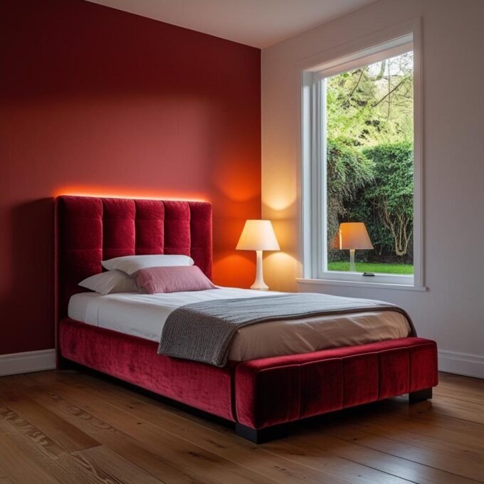
4. Pantone 13-4810 TCX – “Limpet Shell”
Psychological Impact:
Limpet Shell is a cool, calming light blue that symbolises serenity and tranquility. Its soft, pastel hue creates an atmosphere of relaxation and clarity. This colour is perfect for reducing stress and providing a sense of peacefulness in the home.
Best Uses in the Home:
Limpet Shell is ideal for bedrooms, bathrooms, and living rooms where you want to create a soothing, restful environment. It pairs beautifully with soft whites, silvery greys, and light beige, enhancing its calming properties. Use it for walls, bedding, or throw rugs to create a serene and serene atmosphere. It’s especially effective in spaces meant for unwinding after a busy day.
Close Dulux Paint Colour Match: Javan Dawn 3
5. Pantone 14-0442 TCX – “White Grape”
Psychological Impact:
White Grape is a soft, neutral shade of green with a touch of yellow, offering a balance between freshness and calm. This colour promotes relaxation and is thought to invoke feelings of harmony and peacefulness, making it perfect for rooms that need to feel light and inviting.
Best Uses in the Home:
White Grape is best used in living rooms, dining areas, and bedrooms where you want a light, refreshing vibe. It pairs well with earthy tones like taupe, beige, and even darker greens, creating a tranquil atmosphere that doesn’t overpower the space. Consider incorporating White Grape in your decor through accent walls, pillows, or soft furnishings like curtains and bedding.
Close Dulux Paint Colour Match: Kiwi Burst 2
6. Pantone 19-4041 TCX – “Déja Vu Blue”
Psychological Impact:
Déja Vu Blue is a rich, classic blue that symbolises trust, wisdom, and stability. This deep hue has a calming, grounding effect, helping to foster a sense of security and confidence. It’s often associated with clarity and focus, making it ideal for spaces that require concentration.
Best Uses in the Home:
Déja Vu Blue is a sophisticated colour perfect for home offices, studies, and living rooms. It pairs well with light neutrals, deep greys, and soft metallics. Consider using this colour on accent walls, cabinetry, or in textiles like cushions or throws for a touch of elegance. Its depth works especially well in spaces that need a grounding, tranquil atmosphere.
Close Dulux Paint Colour Match: Atlantic Surf 2
7. Pantone 17-6319 TCX – “Kashmir”
Psychological Impact:
Kashmir is a muted, rich green that invokes a sense of peace, renewal, and connection to nature. This earthy green provides a calming, restorative effect, making it an ideal choice for spaces designed for relaxation and well-being.
Best Uses in the Home:
Kashmir works beautifully in bedrooms, living rooms, or home offices where you want to create a natural, calming environment. Pair it with natural materials like wood, stone, or linen to amplify its earthy feel. Use Kashmir for accent walls, upholstered furniture, or decorative accessories to create a peaceful, organic atmosphere.
Close Dulux Paint Colour Match: Amazon Jungle
8. Pantone 14-0757 TCX – “Misted Marigold”
Psychological Impact:
Misted Marigold is a soft, golden yellow that symbolises optimism, warmth, and happiness. It promotes a cheerful and energetic atmosphere without being too overwhelming. This colour can evoke feelings of joy and positivity, making it perfect for spaces that need a touch of warmth and light.
Best Uses in the Home:
Misted Marigold is perfect for kitchens, dining rooms, and entryways where you want to infuse the space with energy and cheerfulness. It pairs beautifully with whites, greys, and soft greens for a balanced, uplifting look. Consider using it for accent walls, rugs, or in decorative pieces like throw pillows and curtains.
Close Dulux Paint Colour Match: Easter Morn 1
9. Pantone 17-1461 TCX – “Orangeade”
Psychological Impact:
Orangeade is a vibrant, zesty orange that conveys excitement, enthusiasm, and creativity. It is a colour that stimulates action and energy, making it ideal for spaces that require motivation and dynamism. However, it can be intense, so it’s best used as an accent colour to avoid overwhelming the room.
Best Uses in the Home:
Orangeade works best in creative spaces like home offices, playrooms, or living rooms where you want to add an energising touch. Use it sparingly on accent walls, art pieces, or small decor items like vases and cushions. When paired with neutral tones like white or grey, Orangeade can bring a fun and lively pop of colour that doesn’t overwhelm.
Close Dulux Paint Colour Match: African Adventure 3
10. Pantone 14-1025 TCX – “Cocoon”
Psychological Impact:
Cocoon is a warm, soft beige with a touch of yellow that evokes comfort, security, and warmth. It provides a sense of grounding and protection, making it a perfect colour for creating a cozy and inviting environment. Its subtle warmth promotes relaxation and a feeling of safety.
Best Uses in the Home:
Cocoon is a versatile neutral that works well in any room, from living rooms and bedrooms to kitchens and bathrooms. It pairs beautifully with a wide range of colours, including soft greens, blues, and muted pinks. Use Cocoon as a wall colour, in upholstery, or as an accent in textiles like rugs, curtains, and throw pillows to create a calming, welcoming environment.
Close Dulux Paint Colour Match: Bracken Salts 3
Conclusion
Pantone’s Spring/Summer 2025 palette offers a diverse range of colours, each bringing its own unique psychological impact to the home. Whether you’re looking to energise a space with vibrant hues like Orangeade and Misted Marigold, or create a serene, grounded atmosphere with colours like Kashmir and Limpet Shell, these colours provide endless possibilities to transform your home into a reflection of your personality and style. By thoughtfully incorporating these shades, you can create a living space that not only looks beautiful but also supports your emotional well-being and lifestyle.


Leave a comment